click below to scroll through pages from the book
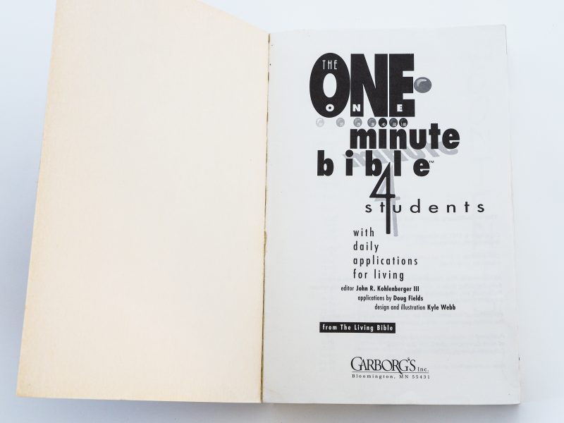
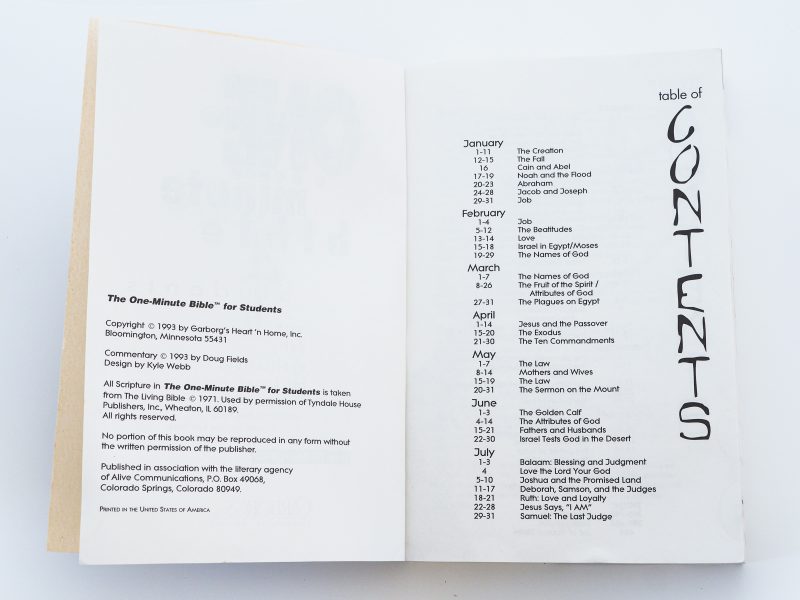
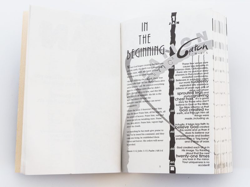
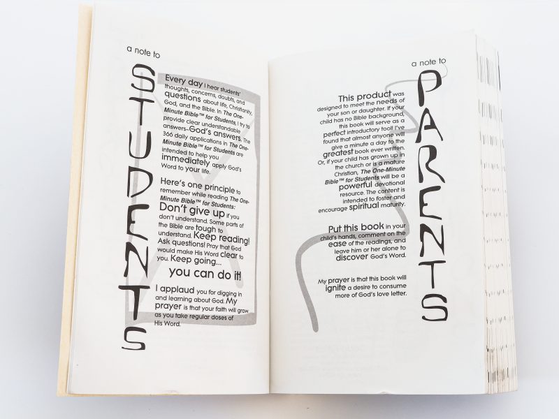
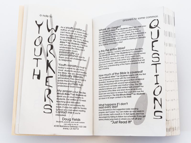
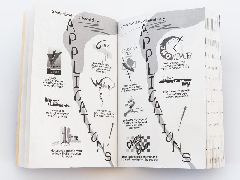
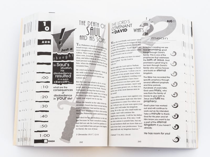
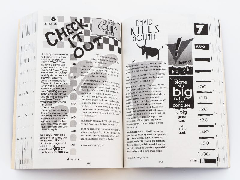
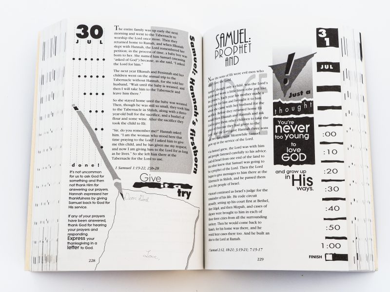
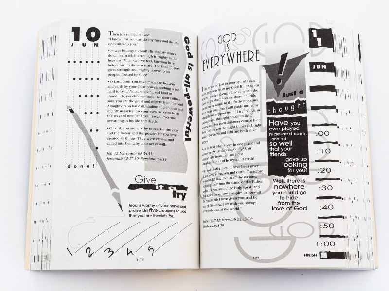
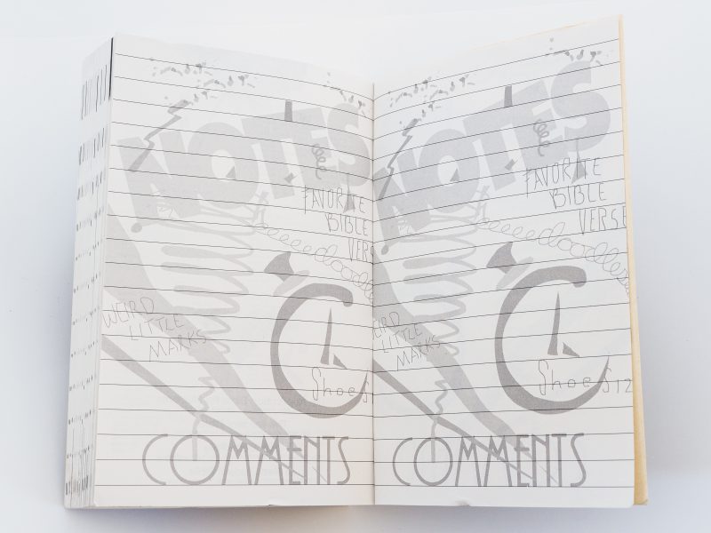
Back in the early ’90’s, a neighbor introduced me to a youth minister they knew who was looking for a designer to help with some projects. Turns out, this youth minister was Doug Fields. We worked closely on the designs for this Bible for months, meeting almost weekly in my “conference room” at Carl’s Jr. Even though I developed 10 basic templates, we looked for opportunities to do unique illustrations throughout that tied into the message for the day. In the end, I laid out every page.
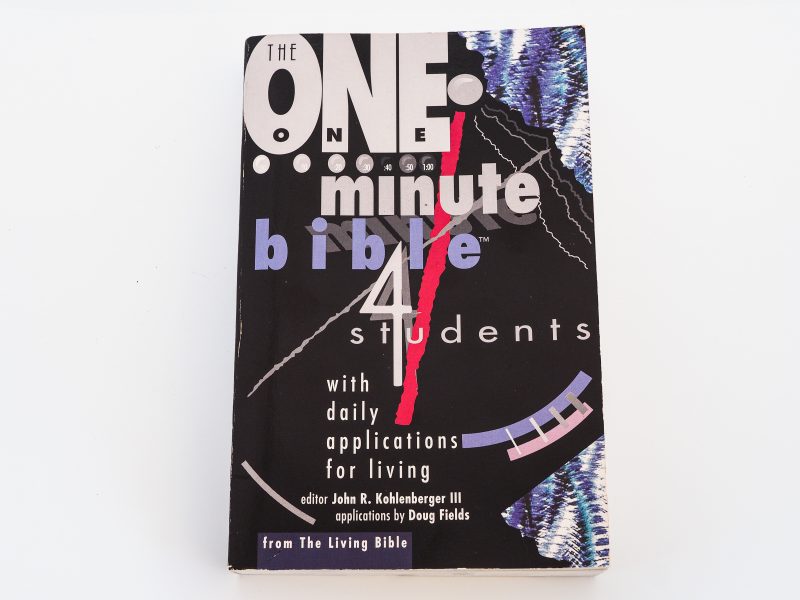
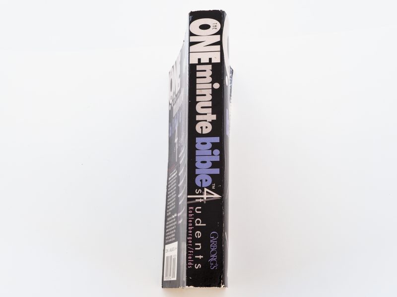
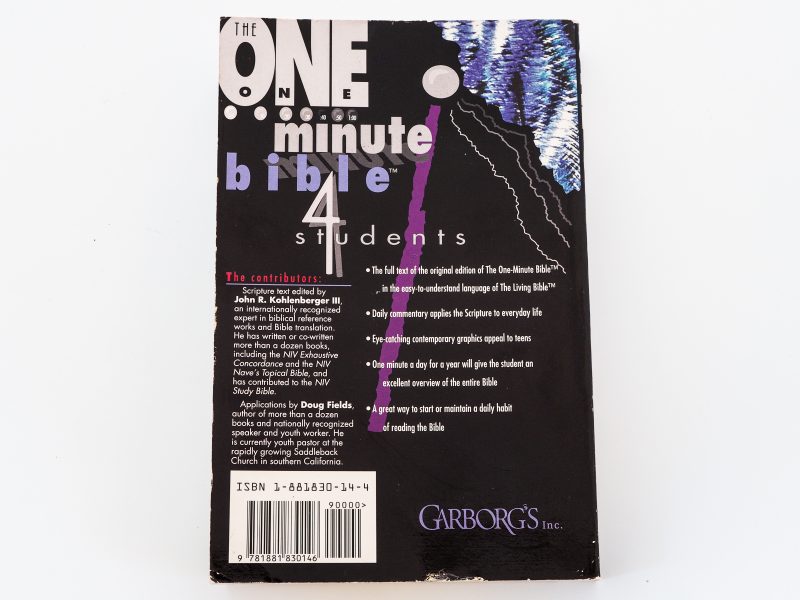
I had designed several draft covers, and after a couple of high school student focus groups, Doug and I decided to ask Garborg’s to do two covers, one black and one white. this obviously is the black one. The white one was the same design, just on a black field.
Even though by today’s standards, the designs clearly feel dated, I feel honored to have had the unique opportunity to design a Bible with graphics relevant to a particular generation. This was also released in England with an Anglicized version I created. Turns out they have “chips” instead of french fries and they spell color weird.

